95% of reach from new audiences
The observation
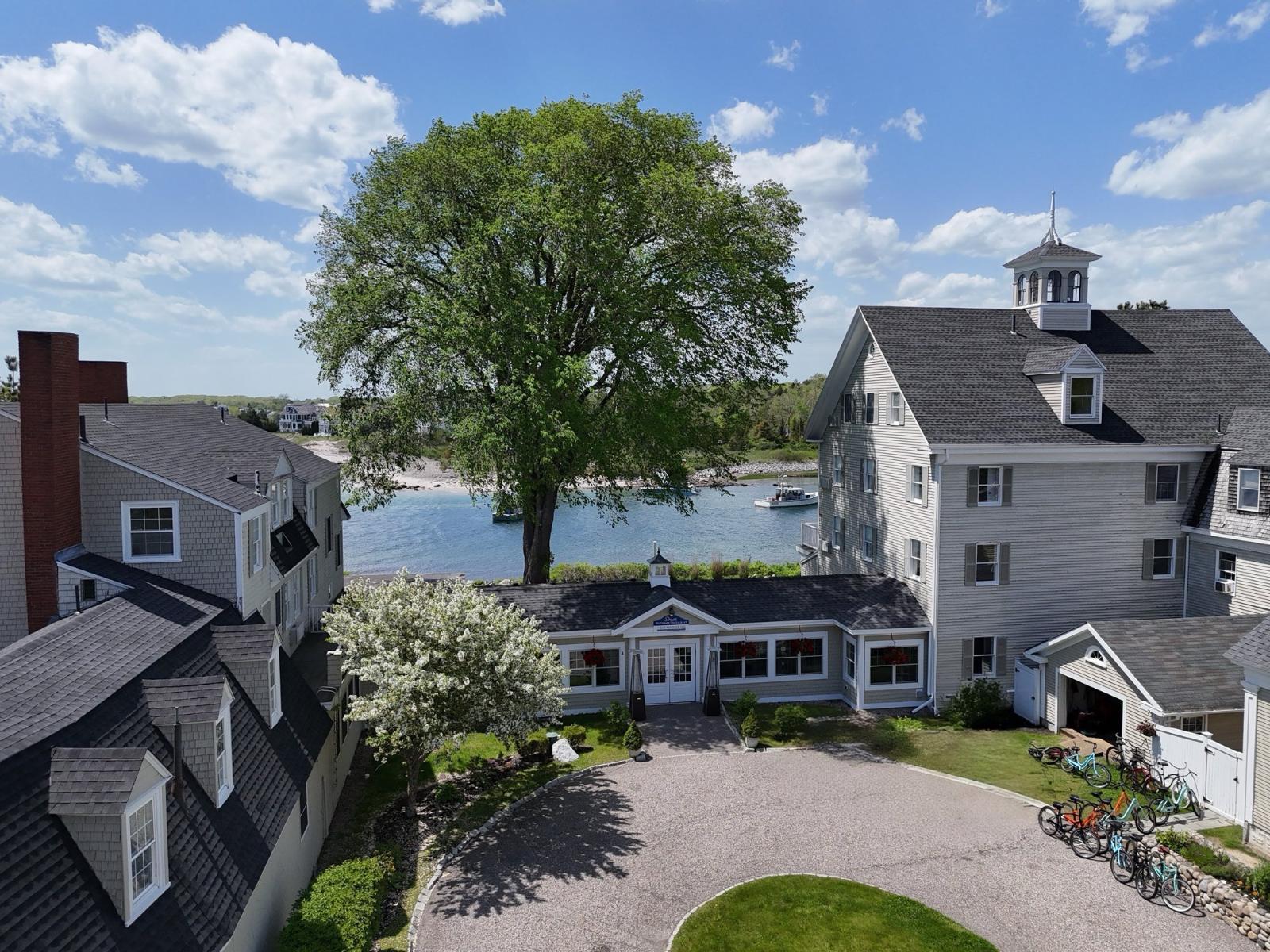
Nobody briefed this. The bikes were one of the first things guests touched and one of the only unbranded objects on the property — a rack of beach cruisers by the door that people borrowed, rode into town, and photographed without being asked.
The opportunity was not to invent another touchpoint. It was to notice what was already working and give it a form that belonged to the property.
KENNEBIKE
A Maine-style plate on the back of a beach cruiser. I designed it in a form guests already recognise, specified it for weather and salt air, and carried it through production and installation. The result turned a borrowed bike into a detail that belonged specifically to the property.


The Breakwater menu
A menu is a working object before it is a piece of design. This one had to be read in the real environment: outdoors, late, by candlelight, by someone who has already had a glass of wine. Type size, contrast, and stock were decided in that room rather than on a screen.

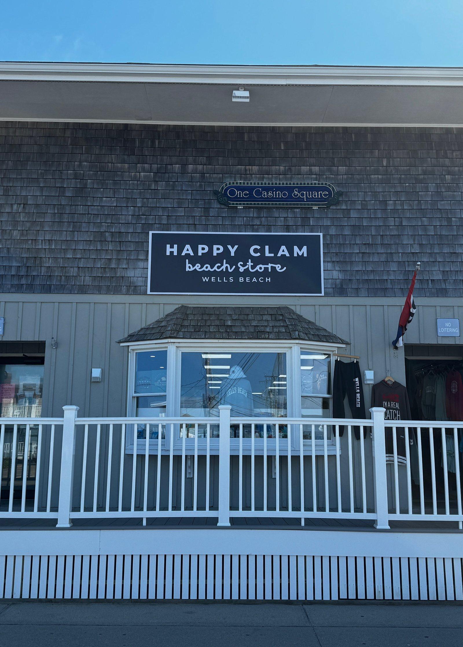
Happy Clam signage
The Happy Clam mark belonged to the client. My role was taking it off the page and onto the building: sign-ready application, material and finish specification, fabrication coordination, and support through installation at Wells Beach.
Back to the portfolio
The physical work only matters because it fed the digital work. Across thirty properties, content and channel strategy used what guests were already doing — the borrowed bike, the evening table, the sign they drove past — so the portfolio spoke with one voice about place rather than thirty voices about rooms.